The slab: designing a voice device that looks like an iPhone
A four-round design conversation that started with "looks like an iPhone" and ended with a 23 × 72 × 10 mm aluminium wand — where the last, hardest detail was making a button that is not a part at all, just a circular cut-out of the body.
let's discard these
let's try this design
- looks like an iphone
- but top half is a screen almost edge to edge
- bottom half is aluminum with a central push to talk button
- edge is beautiful (like on the iphone)
Discarding those. New direction — let me build the slab.
The first renders came out blown to white with the object cropped — the metal was reflecting a white studio box and the camera sat too close. Fixed by dropping the lights, darkening the backdrop to mid-grey so polished aluminium has something to reflect, and pulling the camera back.
Built as a new script, slab.py. 64 × 122 × 9.5 mm — a compact phone footprint, thin enough to pocket.
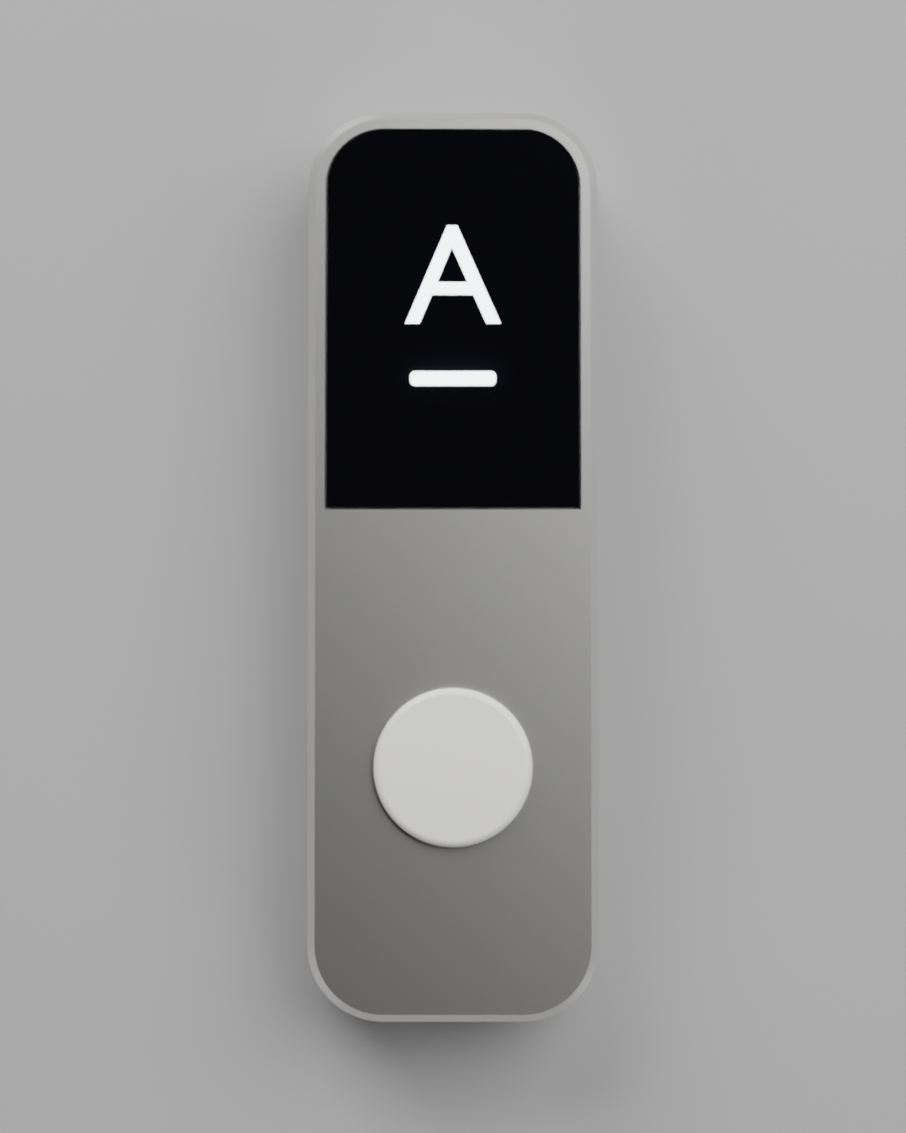
The layout. Top half is a 58 × 56 mm screen with a 3 mm side bezel — genuinely near edge-to-edge. Bottom half is bare bead-blasted aluminium with a single 30 mm ceramic push-to-talk button centred in it. The split reads clearly: one half to look at, one half to press.
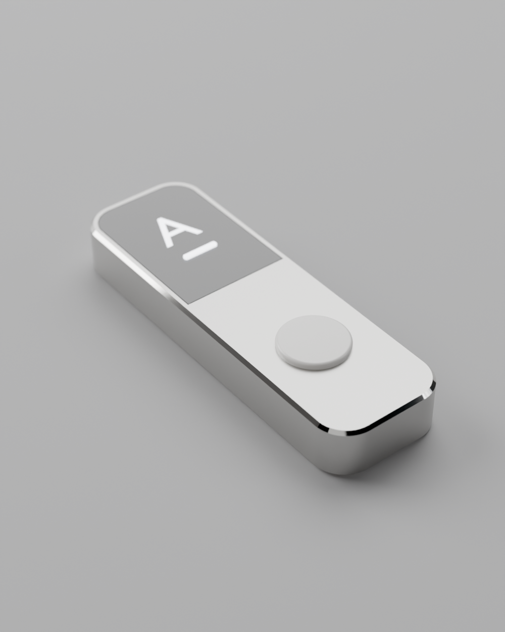
The edge. Flat sides with a polished diamond-cut chamfer top and bottom — the iPhone detail. It's done properly in geometry, not faked: the body gets a single-facet 0.6 mm chamfer, then faces are sorted by normal angle so the chamfer facets get a near-mirror material while the sides and face stay bead-blasted.
Three material takes: a Memory LCD in natural silver aluminium, a dark cover glass version (the literal iPhone read), and a warm champagne aluminium.
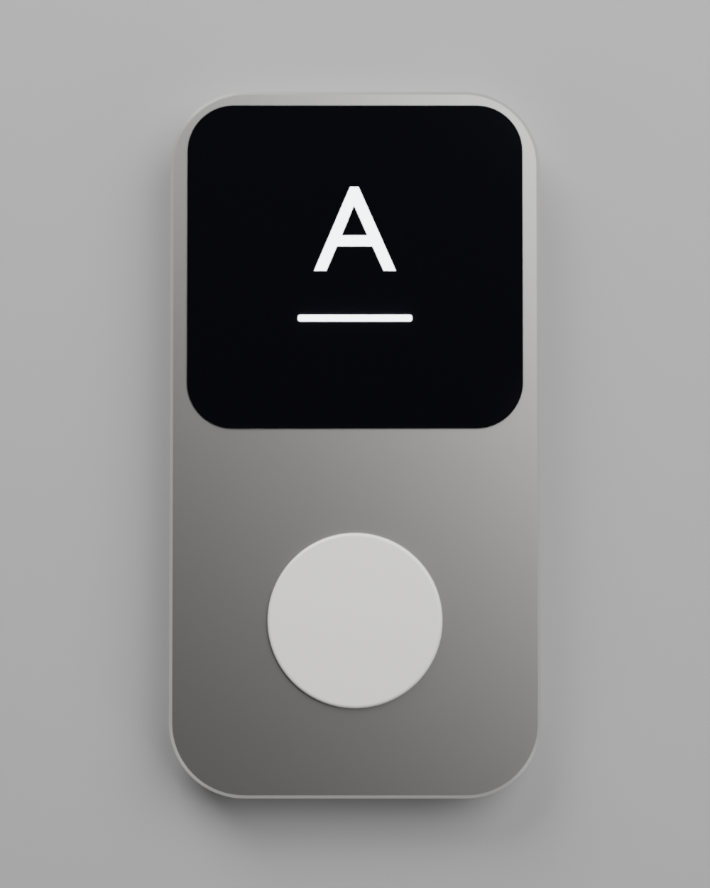
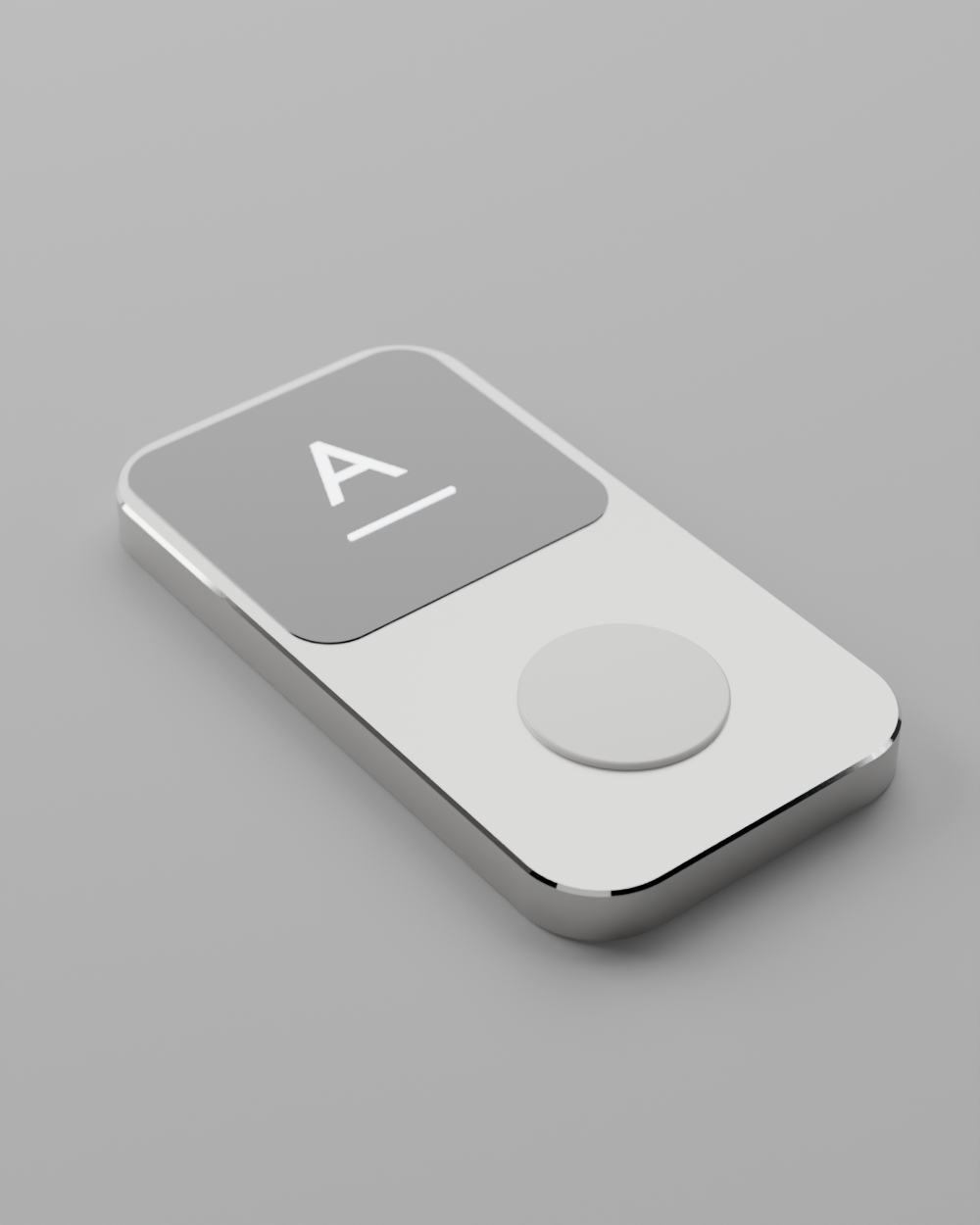
screen should be perfectly flush with the body bottom part of the scren should not have rounded corners button can be a bit smaller yeaah
and let's make the device a bit more narrow (the screen can become more narrow with it) - say screen can be 2cm width and 3cm height
Narrower body, flush pocketed screen with square bottom corners, smaller button. Let me rework it.
All four changes are in. The device is now 28 × 78 × 9.5 mm — a narrow wand rather than a phone slab, and much better in the hand at this size.
Flush screen. The panel isn't sitting on the surface any more — the front face is machined with a 1.2 mm pocket and the display drops into it so its top is exactly level with the aluminium, with a 0.15 mm reveal all round. That hairline is the only thing separating them, which is honest to how it would actually assemble.
Square bottom corners. The screen outline is now built point by point: the top two corners carry a 4 mm radius that echoes the body, and the bottom edge runs dead straight into square corners. It gives the display a clear baseline and makes the metal below read as a deliberate second zone rather than leftover space.
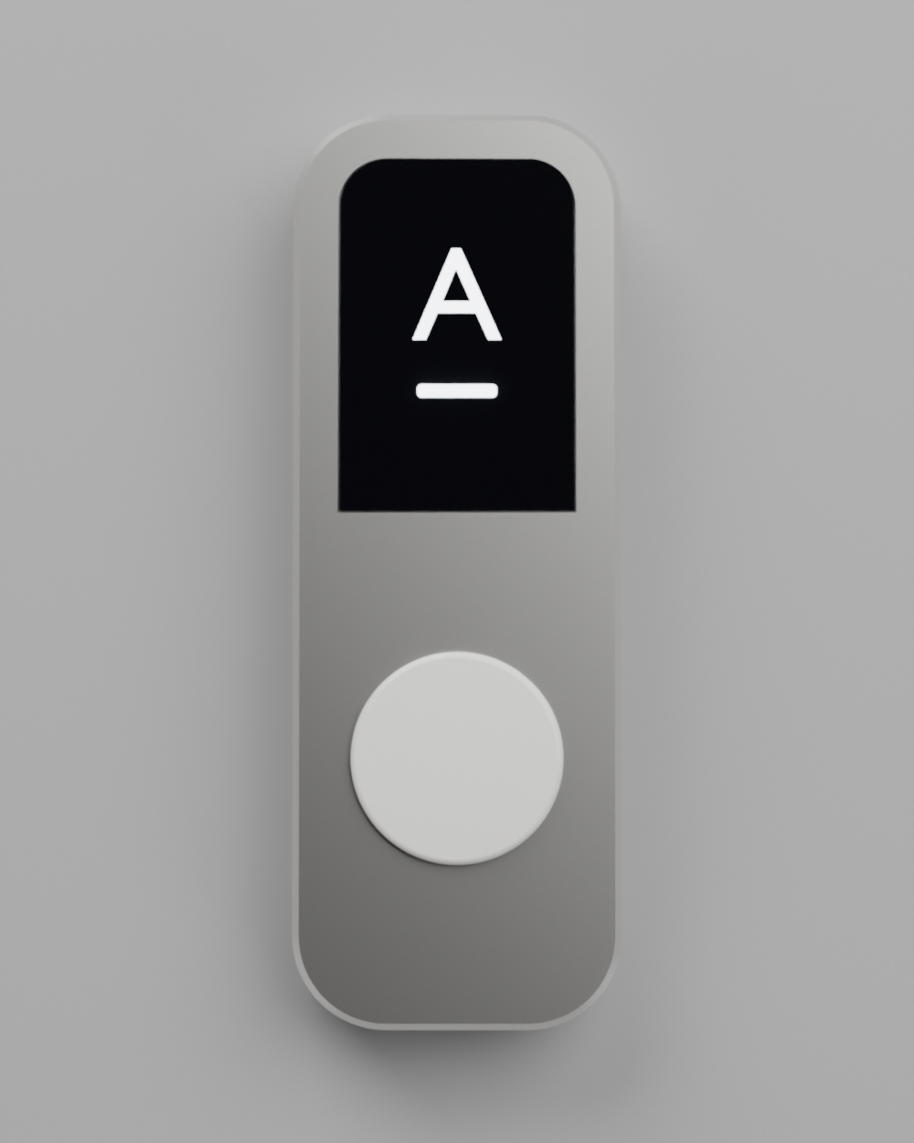
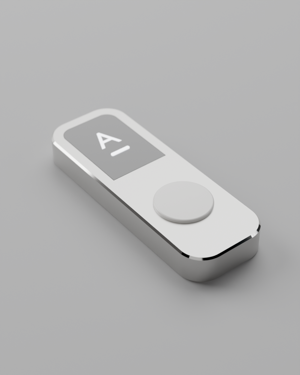
can the screen get all the way to the edges of the device - nearly no bezels?
button can be a lot smaller - let's say 30% less diameter
Screen to the edges, smaller button — narrowing the body so the 20 mm panel nearly spans it.
Both changes are in. The device is now 23 × 72 × 9.5 mm — a slim wand.
Screen to the edges. Rather than growing the panel, I narrowed the body around it, so the 20 mm screen you specified now spans nearly the full width with only a 1.5 mm bezel on each side, and just 1.5 mm above it. The body's plan radius came down to 6 mm so the screen's rounded top corners sit tight inside it.
Button at 12.5 mm, down 30% from 18. It's noticeably calmer, and the extra metal around it lets the lower half read as a surface rather than a bezel around a button.
Two things worth knowing about how tight this now is. The 1.5 mm bezel minus the 0.6 mm chamfer leaves only about 0.9 mm of flat metal between the polished edge and the screen reveal — visually great, but that's the number a mechanical engineer will push back on first. And the side walls are now roughly 1.4 mm of aluminium beside the screen pocket, which is thin for a machined part.
button closer to the screen, with another smaller button below it (like in some of our other designs)
and let's go back to the screen having rounded corners at the bottom as well
Mid-work, David asked how thick the device actually was, and set it to 1 cm even.
All three changes are in, and to answer your question: it was 9.5 mm, now it's 10 mm even. Final dimensions are 23 × 72 × 10 mm.
Rounded corners all round. The screen is back to a uniform 4.5 mm radius on all four corners, echoing the body's 6 mm plan radius. It reads softer than the square-bottomed version — more like a display window set into the metal than a display that terminates. I kept the square-bottom construction available behind a screen_square_bottom flag in case you want to flip between them.
Two-button stack. The 12.5 mm push-to-talk now sits 5 mm below the screen edge instead of floating in the middle of the lower half, and a 7 mm secondary button sits 5 mm below that, slightly less proud so it reads as clearly subordinate. The grouping is much tighter — the three elements now form one column rather than three separate events.
the bottom button should be made from the same material as the body of the device, and be flush with the device
Modelled it as an aluminium disc dropped into a shallow pocket, top level with the metal.
It kept rendering as a shiny dome. Three theories tested and discarded: object-space texture scaling (switched the blast grain to world position so body and button share one grain), smooth shading bending the flat cap (forced flat shading), and the pocket being too deep. A diagnostic confirmed the geometry was already correct — 0 smooth-shaded polys, cap normal exactly (0,0,1), top at 10.002 mm against a 10 mm body.
Geometry was correct all along — flat cap, top exactly flush at 10 mm. What reads as a dome is the pocket's shadow ring plus specular lobes on a small metal disc.
is the button flush? it should really just feel like a circular cut out part of the main body
That's exactly what I just switched to — let me render and verify it.
Yes — it's genuinely flush now, and it is literally a circular cut-out of the main body.
My first attempt wasn't that, which is why it looked wrong. I'd modelled it as a separate aluminium disc dropped into a pocket, and even though the geometry checked out, a small mirror-finish disc sitting in a recess reflects the studio into a bowl-like gradient — so it read as a domed insert, or in the hero view as an empty dish.
The fix was to stop treating it as a part. There's now no separate button object at all. The only thing cut into the device is a 0.16 mm wide, 0.35 mm deep ring groove in the aluminium — so the button face is the body's own surface, same machining, same bead-blast, same reflection, continuous with everything around it. It can't read as proud or sunk because it's the same plane.
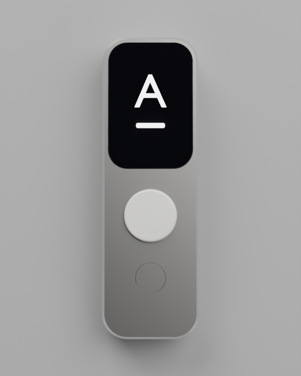
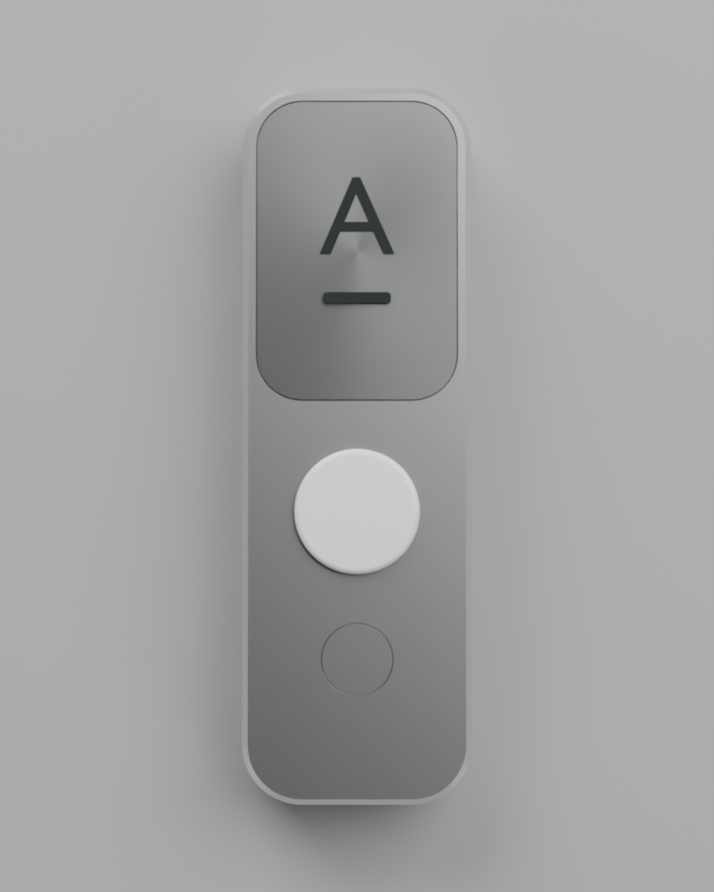
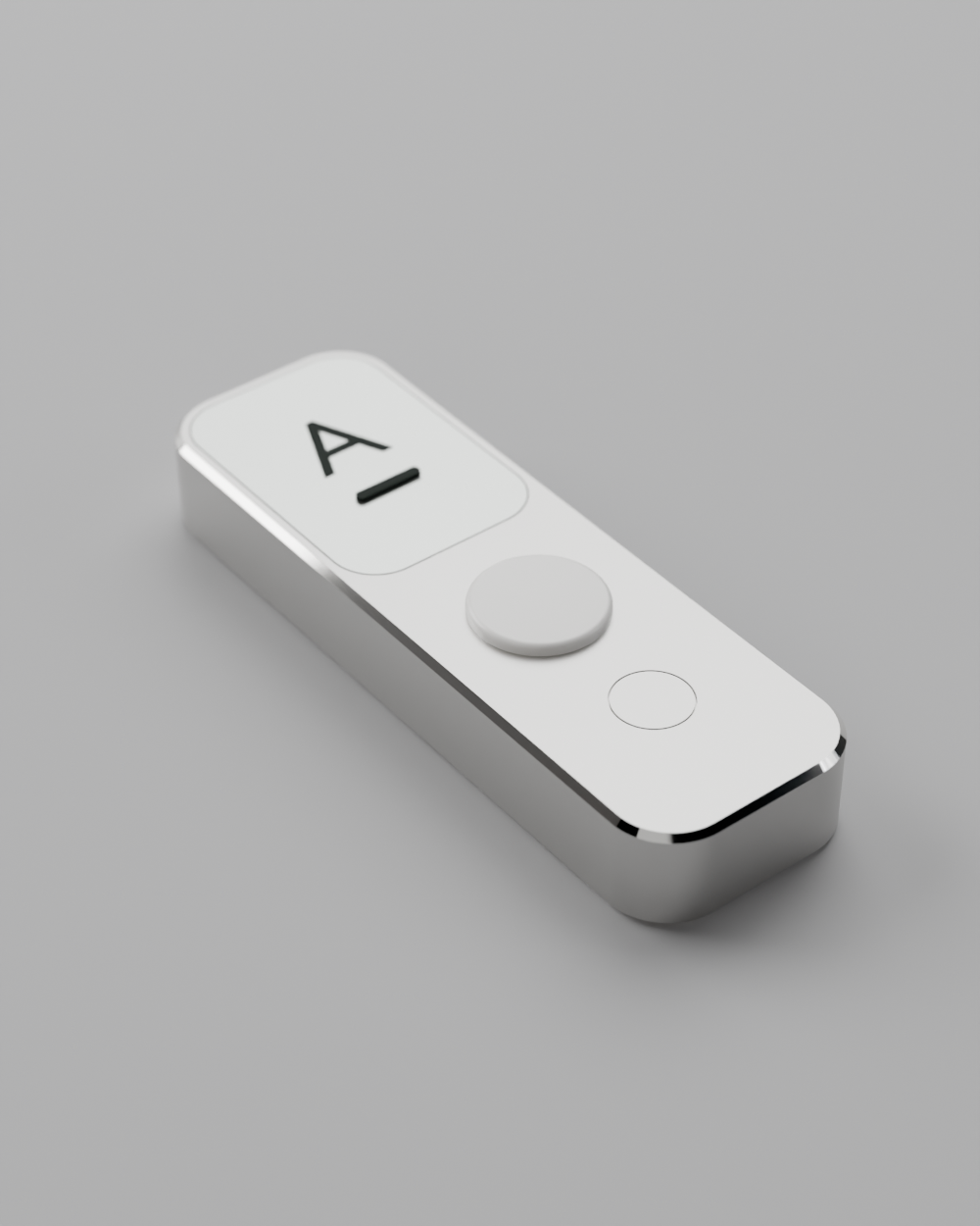
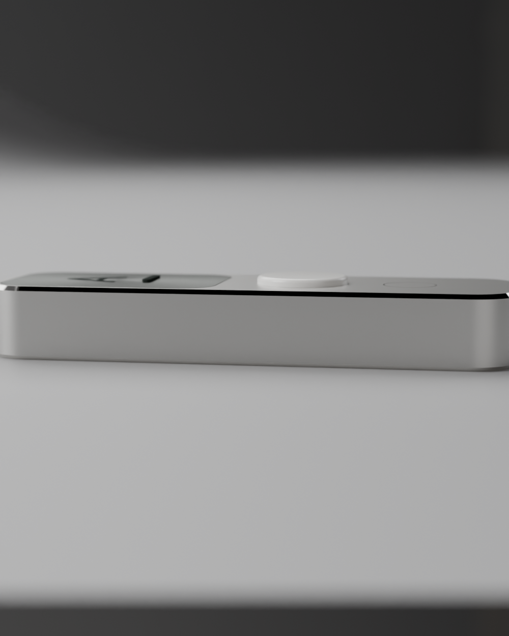
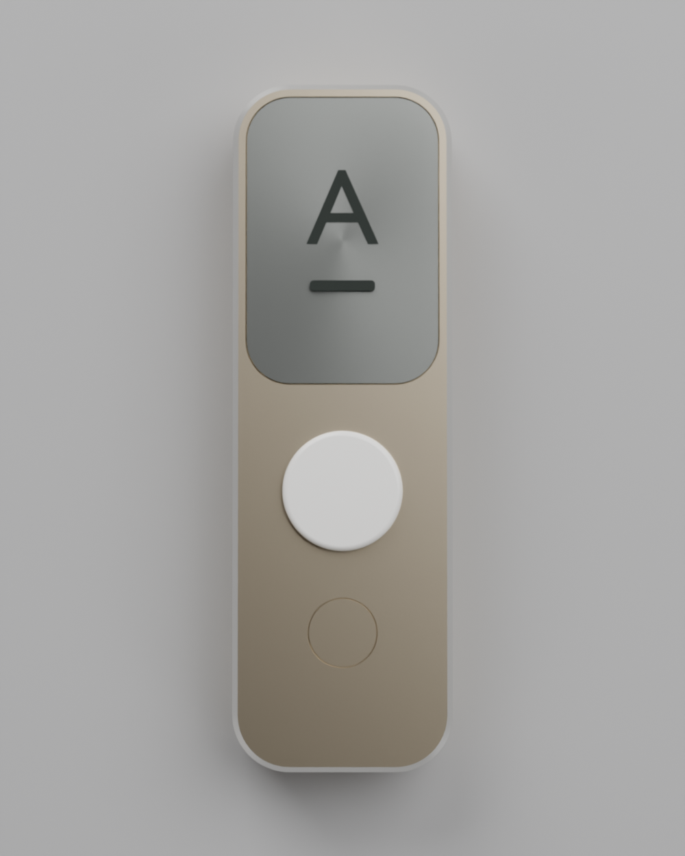
In the face view it's a fine circle in the metal; in the hero view it stays a circle rather than becoming a dish. That's the detail language on things like a MacBook trackpad or an appliance touch zone — the part announces itself only by its parting line.
Worth noting for the real build: a groove that fine is right at the edge of what's visible, which is the intent, but it means the button relies on a membrane or capacitive sensing underneath rather than visible travel. If you want it to feel like a press rather than a touch, the groove needs to widen to roughly 0.3 mm to give the part room to move — still a hairline, just a slightly more honest one.